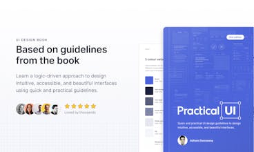
Practical UI

Practical UI

A book to learn a logic-driven approach to UI design

5.0
29 reviews

1.9K followers

A book to learn a logic-driven approach to design intuitive, accessible, and beautiful interfaces using quick and practical guidelines.

This is the 3rd launch from Practical UI. View more

Practical UI - Figma Design System

Figma design system and UI kit
Practical UI - Figma Design System was ranked #4 of the day for July 30th, 2024
A lean and powerful Figma design system and UI kit to help you design just about any website or application you can imagine.
Practical UI - Figma Design System gallery image
Payment Required
Launch Team / Built With

What do you think? …

Adham Dannaway
Hey Hunters 👋, I’ve been pushing pixels since 2005 and have studied hundreds of design systems over the years, even before they were called design systems. I wanted to share what I’ve learned by creating a lean and powerful Figma design system that's intuitive, accessible, and beautiful. Creating this design system has truly been a labour of love and I've spent thousands of hours crafting every detail. It's based on logic-driven design guidelines from my UI design book, Practical UI, which has helped thousands improve their interface design skills. This Figma design system has all the usual stuff including colour, typography, and spacing variables, light and dark mode, layout grids, and a comprehensive component library. Here's what sets it apart from other design systems: • A simple yet powerful colour system - a concise set of variables are cleverly named and organised based on how colours are used. Transparent colours, rather than solid colours, are used to help ensure components look consistent on different coloured backgrounds. • Depth done right - elevation or depth is often done incorrectly. Shadows work well to indicate different levels of elevation in light mode,
but they’re difficult to see in dark mode. So, progressively lighter background colours are used to help indicate elevation in dark mode. Light comes from above, so the highest
elevation level is the lightest. • Interaction states - to speed up prototyping, interactive elements change their appearance when they’re interacted with. Hover and press states are indicated using a transparent overlay that sits on top of interactive elements. • Accessible and user-friendly - components have been designed based on extensive research to be intuitive and inclusive with hundreds of variants and powerful properties. To celebrate the release, I’m offering a 30% discount for 1 week only. There's also parity pricing for supported countries as well as a student discount. I hope you find the Figma design system helpful. Keen to hear your thoughts and feedback 😃 Cheers, Adham
Adham Dannaway
@subham_sahu1 Thanks 🙏 I've used auto layout to create all components to ensure that they're responsive. For some components, I've created mobile variants if needed. Luckily, I've found that many components work across desktop and mobile already.
Adham Dannaway
@subham_sahu1 Thanks, glad you liked the 16 tips article. Seems to be helping lots of people which is great.
Yura Turivny
@adhamdannaway Adham, your dedication truly shines through in this Figma design system! The focus on accessibility and usability is commendable. The transparent color approach and depth solutions are genius. Excited to see the impact! 🚀
Adham Dannaway
@yura_turivny Thanks, that's great to hear. I combined the best parts of hundreds of designs systems to create this one and also tried to fix the pain points I noticed too.
Abinash Mohanty
@adhamdannaway Thanks for putting so much effort into building this logic-driven design system. I can't wait any longer to try it. Great stuff, Adham 🤌
Bon
I am a developer and recently, I have been learning Fgima! Practical UI seems to be very useful to me! Congrats on your launch, Adham. Best luck!
Adham Dannaway
@bonvisions thanks 🙏 You can definitely learn a lot from this Figma file. From how to create components to how to set up variables and styles. Hope you find it helpful 👍
Ramya PK
Hi @adhamdannaway , I noticed your design system is based on guidelines from your book, Practical UI. How do the principles in your book translate into the Figma design system? Any particular aspect you’re most proud of? Great launch!
Adham Dannaway
@ramya_pk Thanks. There are so many things including the colour system, accessibility guidelines, typography, spacing, and alignment. The list goes on. The colour system was definitely the toughest problem to solve. I looked at hundreds of design systems and spent months to get it right. Have you read the book yet?
Ramya PK
@adhamdannaway Not yet, but i'll add it to my list Good luck with the launch!
Adham Dannaway
@ramya_pk thanks 🙏 Hope you find the book helpful too.
Practical UI gallery image

Practical UI Launches

Do you use Practical UI?

Review Practical UI?

5/5 based on 29 reviews
View all reviews

Reviews of Practical UI

Jake Hawkes
4 reviews

Adham offers an invaluable resource for maintaining a better understanding of best practices when you have not been in the trenches of A/B testing. I use this as a baseline for most of my work.

Chris Sciolla
2 reviews

As an engineer with not the best design chops, this book helped me launch a polished product. It would certainly not look as good without the guidance.

Andrii Trush
2 reviews

Good, very good! Simple and playful book about UI Design. It’s my favourite!

View all 29 reviews