


Thoughts on the new product/hub redesign?
Product Hunt has launched a significant reconfiguration of the product hub — embedding launches within a company's or hub's frame:
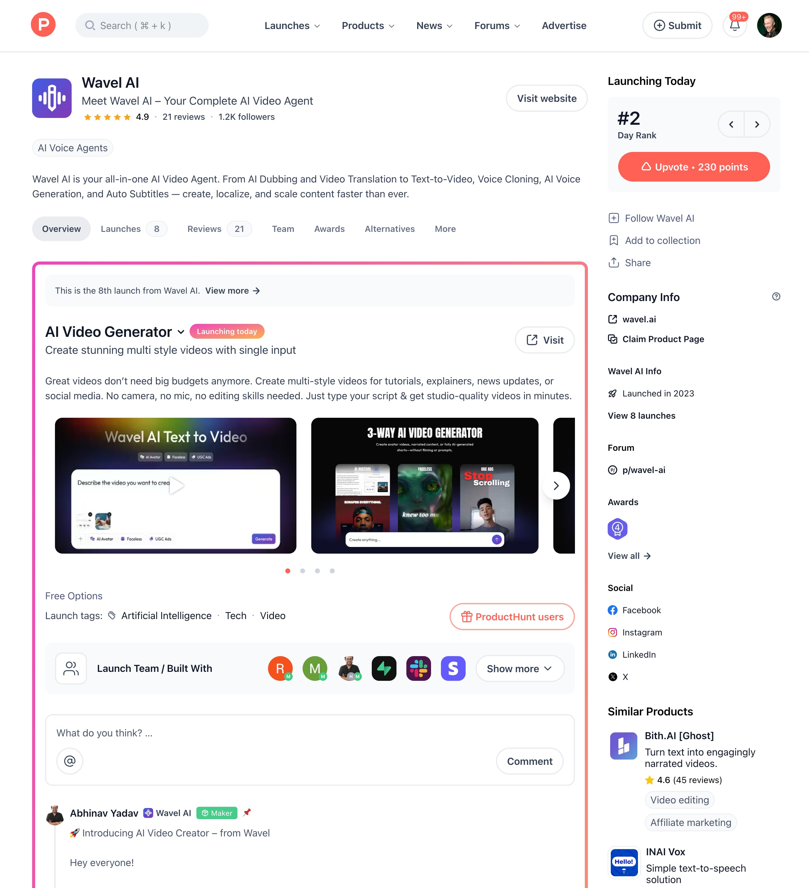
The upvote button (which now reports total points) is to the top right, and the right rail has also been redesigned.
394 views
Replies
Confusing when I first looked at it. But we may get used to it. :)
Launch post header image removed.
I like that the launch post now highlights the hub details as well. But new users may feel overwhelmed.
@rohanrecommends I agree with you about feeling overwhelmed. There's now so much information coming at me... that it's hard to tell what's new vs old.
The information hierarchy feels too flat.
I need to get used to it. :)
@busmark_w_nika Same. Interesting move to embed product launches into a broader company or hub context. I get the idea, but honestly, the new layout feels a bit disorienting right now. Hope they fine-tune it with community feedback.
@alona_williams Sometimes I have some bugs, 😬 but I hope it will get fixed soon. 🙂
Atlas
WHOA... looks like they changed it back!
Atlas
some have the gradient border and some don't ... i don't understand why.
@laura_cruickshanks it's based on whether there's been one or more launches for the same product.
Atlas
@chrismessina hmm... that's so nuanced. i don't know if most users will figure that out.
alright...without me investigating. my guess is that 1st time launchers have the gradient and those that have launched before don't get the gradient. i imagine that PH would want to celebrate the 1st time launchers.
now time for me to go see if that theory is true....👀
Atlas
@chrismessina well...i was wrong. LOL
the reverse is true. 😂
Atlas
As a fairly new user, I like it! Makes it easy to see what the company is up to.
Adapting to the new interface has been challenging. I’m especially frustrated that the option to view product details on the same page has been removed. It now takes extra effort to check the details of a launch, as I have to either open them in a new tab or navigate back to the main page afterward. :-(
Product Hunt
@learnxdesigner have you tried using left and right arrows to scan through launches?
Jo
@learnxdesigner @rajiv_ayyangar I think this navigation is one of the things that's been lost? Not sure if you're running A/B tests here, but this is what I see:
Starting from home, when i click on a product it takes me to the new hub page for the product incl the new launch in a red-bordered frame
This page is a dead-end. On launch day, I'm not looking for info on previous launches, history etc -> i'm here as a user to discover all the products quickly, pause at ones that catch my eye, perhaps try / upvote and move on to the next.
Currently I'm being forced to (1) look at a whole bunch of un-necessary (for me as a user) information and do an in/out navigation back to main page.
Impact -> While PH is optimising for page views here, i think new launches will be hurt a lot. I will now optimize even more on the 1-line description on the main page to take the pain to click in.
I really hope you would reconsider who these changes were meant for and put your users and startups back front and center.
Jo
@learnxdesigner @rajiv_ayyangar FYI this is what I'm seeing -> there are no left/right arrows ...
@ragsontherocks the arrows should be near the upvote button:
@rajiv_ayyangar Left-right arrow I noticed after reading the comments here. But, it forces me to go to each product sequentially. Old flow allowed selective preview in like center peek. I don't know if others are enjoying the new flow. But, I usually go through the entire list of release most days and I like the old preview.
Honestly, if I didn't look closely, I would have thought it was an advertisement
Atlas
the gradient box looks like an attempt at staying hip
I'm a newbie and need to get used to it.🤔
super confusing
Kinda like it, given how many iterations of launches some companies and product are going through.
not a fan tbh
IXORD
I don't really like it when the design changes like that, but it's only the first two weeks when I get used to it :)
Foundity
Took a couple seconds of staring at it but I'll adjust.. maybe
Lancepilot
Noticed this.
I thought I misclicked somewhere when I didn’t see the old one… The new design offers a more compact layout, but I guess we all just need to get used to it :)
Jo
One more UX confusion feedback -> with the Athena launch page today. It is somehow listed as a new launch by 'Kaizala chat app' - it is really confusing with seemingly no connection between the two. The listing says Athena on the PH homepage but when I click in, what I saw on top was Kaizala. What made this worse was the 'Visit Website' is broken - goes to a 'page not found' on MSFT's website.
This was maybe a simple mis-tagging issue (just an assumption) since it was hunted by @zaczuo and not the makers, but in the older design this would not be an issue as the launch itself - Athena - would be highlighted.