


Ever wondered what bird tweets look like visually? 🐦
Ever wondered how to make data truly come alive?
With Datastripes, it’s not just charts and dashboards, it’s full-on visual experiences.
Imagine taking something as subtle and complex as birdsong and turning it into a live, interactive visualization.
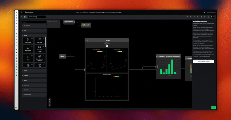
Each tweet, chirp, and frequency can be represented as nodes and streams, mapped to colors, shapes, and motion. You can watch patterns emerge, clusters form, and even hear audio feedback if you link it to sound nodes.
Datastripes isn’t just about looking at numbers, it’s about feeling the data. You already know it: drag-and-drop nodes let you transform raw streams into multi-sensory outputs, combine live APIs with custom code, and instantly share it without a backend.
Being a general and adaptive tool, you can build anything from a bird-call visualizer to interactive dashboards for financial data. Datastripes provides the tech, you provide the ideas...
What’s wild is that it’s all real-time. Unlike static dashboards, you can tweak, reroute, or add nodes on the fly and immediately see the effects.
That’s what makes the experience "wow": you're not just interpreting data, you're exploring it, interacting with it, and even telling a story with it.
If you’ve never seen something like a birdsong visualization rendered in motion and color, this is the kind of thing that makes you rethink what dashboards can be.
Want me to show an example setup for a live birdsong visualization in Datastripes?
Sign up now to the full free early access: app.datastripes.com
Replies
Datastripes goes beyond charts and dashboards — turning data into a real-time, multi-sensory experience. Love the creativity and the potential applications
@gbellorio Ahaha thanks Gianni! You’ve been seeing Datastripes grow for three years now, back when it was still called Kenevra and Queric.